Entries in the 'Uncategorized' Category

Welcome. Prepare to Dive In.

The Folder

Assignments

We begin the semester learning how to capture images and manipulate them in Photoshop.Discussion and hands-on exercises will explore:

  • Digital cameras
  • Photoshop’s work environment
  • Color Modes/Models
  • Resolution – ppi, dpi, lpi
  • Masks & Simple Selections
  • Tools & Palettes
  • Brushes
  • Color Picker
  • Introduction to layers
  • Printing from Photoshop overview
  • The Journal

ROBIN WILLIAMS ON DESIGN

ANDREW MUNDI ON DESIGN

Why Design Wise words from design authorities, reading assignments, et al.

(Be sure to follow this link to additional reading assignments and exercises.)

Illustrator – Vectors Generate High Res Graphics

Reading:

  • Shepard Fairey interview with Terri Gross
  • Layout Workbook – p.72-87 – The Interaction of Visual Elements

Illustrator Templates will be reviewed in class. No folder necessary for this assignment. Just submit digital files.

Guidelines for Submitting Photo Retouching

For each of the two images (Joe & Lou and Fancy Lady) we have been repairing, please turn in the following:

  • Printed Files
  1. Before – the original, unaltered images
  2. After – the completed, repaired, retouched, collaged full color image
  3. File on left side of The Folder – Completed assignment sheet. Any additional notes as desired
  4. File on right side of The Folder in reverse chronological order – printouts of the project at each significant stage of development. Include any communications or notes with further instructions pertaining to development

Joe & Lou – You have a couple of options on how you re-build the Joe & Lou image once you have completed the appropriate repairs.

  1. You can include a new sky, one of your original photos, and render the entire image as a full color image. Using the techniques practiced in class, make everything look natural.
  2. You can select, copy and paste Joe & Lou into one of your original photos.
  • Digital Files

It is not necessary to submit a digital “before” picture for either image. After Only

Due Wednesday, February 17th

Recap of the ‘Fancy Lady’ exercise

Let’s take a look at the original image as photographed. The original measured about 18×24 inches and was photographed with a Canon Digital Rebel. The client’s objective is to restore the image to match original as closely as possible.
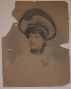
fancy lady before

fancy lady before

It’s important to analyze the image before deciding how and where to begin.  Is this a photograph, a drawing, or both? My impression was that it was very photographic in look and feel, but but definitely hand drawn, possibly from a projected image.

The substrate is a multiple ply, non archival material, discolored from the paper’s acid content.  The only distinguishing mark in the background is the soft blue halo behind the lady. Rather than repair the background, a decision is made to replace it with a brand new digital background that imitates the airbrushed halo in the orignal.

The hat requires repair.

The tear that runs across the neck and chin need repair.

The lady’s dress should be distinct and separate from the background.
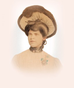
Fancy Lady After

Fancy Lady After

Here is an example of the repaired image.

As you look at it, study each element and decide how you would build the image, layer by layer.

From the bottom up, we have the background color layer, the blue halo layer and the lady layer.

As you repeat/complete this exercise, keep the following in mind:

  • make accurate selections
  • pay attention to selection edges
  • remember to deselect when appropriate
  • save a selection for later (select menu)
  • levels applied with an adjustment layer affects all layers below
  • merge selected layers if necessary
  • pay attention to what layer you’re on and the order of your layers

I am frequently asked why I choose one technique over another, or perform one action before another, instead of after.

Sometimes I have a very logical, reasonable reason for doing things in a particular order, but frequently there is no real right or wrong way. There are a myriad of ways. For each problem presented in restoring this image there are dozens of solutions. As designers we are challenged to come up with a creative solution and execute the design within the constraints of time and budget.

Each image presents its own set of unique challenges, and restoring photos can consist of lots of missteps. The path to restoring a photo is not always the straight road that we went down in today’s class. Try starting over to see if you can repeat what we did in class. Take it one step at a time, one layer at a time. Give your layers a logical name so you don’t get confused, and remember, practice makes perfect.

GRM23-Haberman Week 1

We begin the process of learning how to capture images and manipulate them in Photoshop. Discussion and hands-on exercises explore:

  • Digital cameras
  • Photoshop’s work environment
  • Color Modes/Models
  • Resolution – ppi, dpi, lpi
  • Masks & Simple Selections
  • Tools & Palettes
  • Brushes
  • Color Picker
  • Introduction to layers
  • Printing from Photoshop overview

Using techniques reviewed in this week’s class, create a self-portrait and attach it to your email attendance. You are required to submit an image with each class attendance email. The images should be representative of the work you did in class during each session. Your images do not have to be complete, and they will not be graded until the folders are turned in.

  1. The image attached to attendance demonstrates that you participated in classroom exercises and activities.
  2. The images indicate you are practicing what you are learning.
  3. The images help to identify your email in a unique and personal manner.

ROBIN WILLIAMS ON DESIGN

ANDREW MUNDI ON DESIGN

The purpose of these two exercises is to give students a understanding of how raster images and their layers behave.

Why Design Wise words from design authorities, reading assignments, et al.

(Be sure to follow this link to additional reading assignments and exercises.)

Making Selections – In-class exercise

Spheres – In-class exercise – due Jan. 25 beginning of class.

  • Beginning Layers
  • Marquee Selections
  • Simple Gradients
  • Modifying the edge of a selection

HOMEWORK:

What is Graphic Design?

I typically pose this question at the beginning of every GRM23 class, and I’m usually met by a classroom of blank stares.

John McWade recently posed this question in his online magazine, Before and After, with some interesting responses.

Greeting Card Set

Scope of Project: Design and produce a set of four greeting cards with envelopes. The card size can be A2, which when folded is 4.25″ x 5.5″, A6 – 6 1/4″ x 4 5/8″, or A7 – 5″ x 7″.  You must have printing on the front and the back of the cards…printing on the inside is optional. The cards should be folding cards.

Materials: Your choice, as long as you follow these instructions:

The illustrations from each of the four cards must be your own original artwork. Absolutely no stock images. Photos or artwork in the illustrations must be your own work.

The four cards must be related to each other. The way in which they relate is part of your design decision and creativity…they can relate by style, color palette, topic, typography or other graphic device.

While you must output your final cards in color, you can complete the cards and envelopes using your choice of materials, with the object being to develop and creatively present a set of four related original greeting cards with hand crafted envelopes.

Workflow: You may use Photoshop and Illustrator to prepare the greeting card images. Use Adobe InDesign to set up the file for print. Then export the InDesign file to Adobe Acrobat in press resolution for your final print output.

Steps for creating the greeting card layout in InDesign.

  1. In the “new document” dialog turn off facing pages. Your greeting card will have an outside front and back which print on the same page, unfolded. If your card opens to a verse, add a second page. Turn off “facing pages.”
  2. A horizontal, greeting card when opened flat has a horizontal fold down the middle, a vertical card has a vertical fold down the middle. When setting up the new document, take into account that the card width will double on a vertical card, while the length will double on a horizontal card.
  3. Set appropriate margins if your card is going to have a white border or if you need a guide for your type.
  4. If your card is going to bleed, make sure to indicate .125″ bleeds in the document setup dialog before clicking ok. If you don’t see the settings for bleed, check the “more options” button.
  5. With the new document open, go to the Layout menu>Create Guides. You can divide the page in half vertically (2 columns with 0 gutter) or horizontally (two rows with 0 gutter).
  6. To import an image from Illustrator or Photoshop, go to File>place.
  7. Size the image appropriately
  8. Add type and logo or other graphic to back of card.
  9. Create a second page in the page palette by dragging a blank page from the top of the panel just below the icon for page one, and add type for greeting if desired.

The Folder

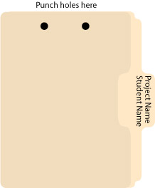
Every assignment must be kept in a 3- or 5 tab manilla folder. The name of the assignment should be written on the tab, along with your first and last name. The folders should be punched with a special two-hole punch, which is kept in the Com151 classroom. (It wanders and the computers are black like the punch, so we may have to be on the lookout.) You’ll need to purchase the steel fastener bases to attach the paperwork generated for each assignment. And you thought with computers, we’d print less?

To assemble, the tab should be on the right with the holes punched on top.  For our first few projects you will generate a project sheet by printing the blog entry describing the project.

folder front

TIP: Label all printouts with their corresponding electronic file name

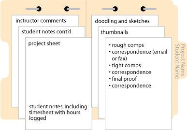
open folder with contents

Punch and attach the finished project sheet on the left. As you work on a project, you should be keeping track of the time you spend on each facet of the job. It is likely that you will need more than one work session to complete a project, so make sure you keep track of all time spent.

The right side of the folder is for all of the “paper” you generate over the course of the project. These procedures will help organize the workflow on any given project.

Folders and electronic files for all of your projects should be brought to all class sessions. They should be available at all times so that the instructor can advise you on your work habits and give you feedback on your design work. The folders allow the instructor to determine a your progress and spot areas of strength and weakness.

Most important, the folders are a tangible record of the project and the communication between student and instructor that illustrates the steps toward completion.

Calendar Grid with Sliding Numbers

Creating a calendar from scratch and setting up the dates for each month can be tedious and frustrating, but it doesn’t have to be. The following method works equally well in Adobe Illustrator or Adobe InDesign.

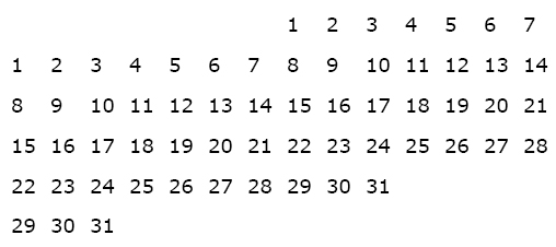
Begin by creating a paragraph with 14 tab stops using an alignment of your choice. Use these paragraph settings to create a grid of numbers which you’ll duplicate and use on each of the subsequent months. The size of type and amount of leading in your number grid depends on the overall size of the squares used for each day.

For the first line in the number grid, press the “tab key” seven times to move the cursor to the correct position to begin numbering. Set up a grid of numbers as shown below.

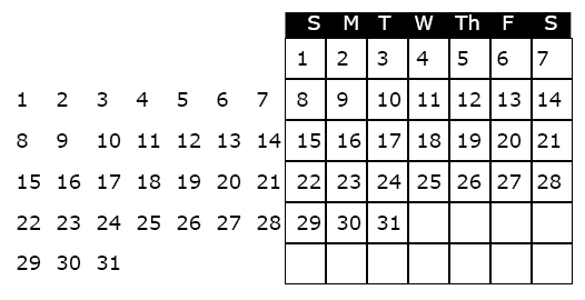
The next step is to create a an actual grid, or table to “hold” the numbers and daily information. To create the grid, use the table tool, or create a square that is the same width as your tab set, and depth equal to the leading. Use the “step and repeat” feature to duplicate the squares, and label the days of the week at the top of the grid. When the grid is completed it should look like the illustration below.

To use the calendar in a document, highlight the unused dates and make the type the same color as the background (usually white, i.e., no ink printed, so that one can write in the grid).

To create the calendar for the next month, highlight the number grid with the arrow tool, slide it into the appropriate position and white out the unused numbers.

Hope this technique saves you some time and frustration!

Find/change Makes Quick Work of Text Editing

Really, it does.

Let’s say you just imported data from Excel into an InDesign Table, and low and behold, you’re noticing lots of what appears to be gibberish.  Strange characters make your text look like a bunch of “expletive deleteds.” Some of the “garbage” may actually be html code if your text originated on the internet. If it has characters like <p>, <strong>, or </strong>, these are html codes that are mixed in with the text.

In InDesign, go to Edit<Find/Change to bring up the dialog. The tab on the far left pertains to finding and changing any string of text, even “invisible characters,” such as a paragraph return, a space or a tab. You can change the found text to any other string of text or invisible character. You’ll find a chart with the special character codes on pages 421-423 of the InDesign Bible.

The find and change technique makes it easy to quickly search and replace double spaces with single spaces, remove extra paragraph returns by changing to “nothing” so that you can instead insert space above or below the paragraphs and changes crazy codes like (&#39;) which is html for an apostrophe (‘).