Entries in the 'Technology' Category
The Folder
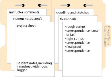
Every assignment must be kept in a 3- or 5 tab manilla folder. The name of the assignment should be written on the tab, along with your first and last name. The folders should be punched with a special two-hole punch, which is kept in the Com151 classroom. (It wanders and the computers are black like the punch, so we may have to be on the lookout.) You’ll need to purchase the steel fastener bases to attach the paperwork generated for each assignment. And you thought with computers, we’d print less?
To assemble, the tab should be on the right with the holes punched on top. For our first few projects you will generate a project sheet by printing the blog entry describing the project.

TIP: Label all printouts with their corresponding electronic file name

Punch and attach the finished project sheet on the left. As you work on a project, you should be keeping track of the time you spend on each facet of the job. It is likely that you will need more than one work session to complete a project, so make sure you keep track of all time spent.
The right side of the folder is for all of the “paper” you generate over the course of the project. These procedures will help organize the workflow on any given project.
Folders and electronic files for all of your projects should be brought to all class sessions. They should be available at all times so that the instructor can advise you on your work habits and give you feedback on your design work. The folders allow the instructor to determine a your progress and spot areas of strength and weakness.
Most important, the folders are a tangible record of the project and the communication between student and instructor that illustrates the steps toward completion.
Must-see video, blast from the past
Calendar Grid with Sliding Numbers
Creating a calendar from scratch and setting up the dates for each month can be tedious and frustrating, but it doesn’t have to be. The following method works equally well in Adobe Illustrator or Adobe InDesign.
Begin by creating a paragraph with 14 tab stops using an alignment of your choice. Use these paragraph settings to create a grid of numbers which you’ll duplicate and use on each of the subsequent months. The size of type and amount of leading in your number grid depends on the overall size of the squares used for each day.
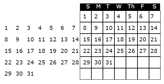
For the first line in the number grid, press the “tab key” seven times to move the cursor to the correct position to begin numbering. Set up a grid of numbers as shown below.
The next step is to create a an actual grid, or table to “hold” the numbers and daily information. To create the grid, use the table tool, or create a square that is the same width as your tab set, and depth equal to the leading. Use the “step and repeat” feature to duplicate the squares, and label the days of the week at the top of the grid. When the grid is completed it should look like the illustration below.
To use the calendar in a document, highlight the unused dates and make the type the same color as the background (usually white, i.e., no ink printed, so that one can write in the grid).
To create the calendar for the next month, highlight the number grid with the arrow tool, slide it into the appropriate position and white out the unused numbers.
Hope this technique saves you some time and frustration!
Tables Simplify Complex Formatting Tasks
Reading: Bible p.547-569 – Setting up Tabs and Tables
While InDesign allows for the most complex of formatting jobs, it supplies a number of tools to ease the tedium and redundancy where formatting text is concerned. When dealing with large quantities of data, such as the information for a price list or catalog, Tables can pick up where Paragrarph Styles, Tab and Paragraph Rules leave off.
First, consider the data flow. The initial data can originate from a number of sources. It may come from Microsoft Word, Excel, or it can come right off the internet. If you are getting the data from a website, ask the provider to export the data to an Excel file. Once you have the Excel file, you can open it and determine if any fields can be eliminated, as it is easier to edit the data before importing into InDesign.
Creating the Initial Table
With the data finally prepared, go to File>Place, importing the Excel file into InDesign. When placing, be sure to check “Show Import Options.”
In the “Show Import Options” dialog, at the top of the dialog you’ll see, “Sheet.” Here, you need to choose the specific worksheet associated with the Excel file.
Formatting: Table > Unformatted tabbed text. By choosing this option, you will be able to control all aspects of formatting the table in InDesign.
With an active text cursor within the table, Select>All and go to the Table Menu>Convert Text to Table. The Column separator can remain set at Tab, and the Row Separator at Paragraph.
Apply Design Styles to the Table
Once your text is converted to a table, it is similar to an inline graphic in that it resides within a text frame. However, to make changes to the table or its contents, use the text tool. With an active cursor in the table, you can edit the column or row size by moving the cursor directly over the line. When it turns to a double-headed arrow, click and drag to change the size. Edit the column widths appropriately so that the rows fit comfortably on a line.
Drag with the text cursor to highlight text in a cell. To highlight all the text in the table, first highlight a row, then go to Edit>Select All to change the font, style and size. Incorporate paragraph styles and a complex task is eased.
The Table>Table Options gives information about the table, and control over the spacing, strokes and fills for columns and rows in the table for graphic customization.
Designing with Line in Adobe Illustrator
The object of this lesson is to create an abstract illustration using ONLY black line — no curves, no fills, no colors. Using design principles reviewed in class, show depth, motion, emotion, in a dynamic and interesting way. You may use the pen tool or the line tool to create straight lines.
Other tools you may use to complete this assignment:
- Use the selection tool (black arrow) with the option key to duplicate
- Object>Transform>Transform Again (or Command-D) to step and repeat
- Rotation tool
- Blend Tool
- Add Anchor Point tool
- Change Stroke Weight
Due. Oct. 2nd at the beginning of class.
Poster-related sites
The role and appearance of the poster has changed continuously over the past century to meet the changing needs of society. Although its role is less central than it was 100 years ago, the poster will evolve further as the computer and the worldwide web revolutionize the way we communicate in the 21st century.
A poster is typically a printed paper announcement that is displayed publicly and functions as a tool for the promotion of a product, an event, or a sentiment or cause through image and/or text. A poster’s principal task is to be noticed: it must attract attention and influence the passerby.
Computer Graphics Classes Start August 18th
There is still room in several great Multimedia and Graphic Design classes being offered in the Fall Semester at Moorpark College, starting on Monday August 18th…
Motion Graphics – MM30
In this class you will learn from Mathew how to create stunning Motion Graphics for TV, Films and the Web. Take your computer graphics and video projects to a whole new level. If you thought Photoshop could help you create coolness, wait until you see what After Effects can do.
Wed 6:00pm
Interactive Design – MM50
In this class you will learn to really use Flash for both fun and work. We will explore various types of interactivity by creating simple games that can be played on not only computers, but handheld electronic devices, and even the Wii… We will learn to create dynamic and stunning websites that even incorporate interactive video, using Flash, HTML and a bit of javaScript…
Thur 6:00pm
Computer Illustration – GR26
In this class you will build a solid foundation in Adobe Illustrator. You’ll start with a tour of important menus, tools, and palettes, then explore selection tools, drawing tools, layers, the pen tool (a lesson unto itself) as well as transformations/ distortions, type tools, and modifying paths and shapes. You’ll be surprised how quickly you begin to master this challenging but rewarding software application.Check out the Flyer – http://www.turbocurl.com/moorpark/gr26_fall2008.pdf MW 10:30am – 1:00pm
Desktop Publishing I and II
Publishing brochures, newsletters, reports, and other print pieces can be a challenge without the right tools. Along comes Adobe InDesign with all the features and flexibility and you’ll need to publish professional-quality layouts. This course will impart a working knowledge of the main InDesign tools and features, everything from basic features to using master pages, importing and manipulating objects, controlling text flow and style, to graphic effects such as transparency, drop shadow, and feathering. Your InDesign training will leave you with an understanding of the software and a slew of great portfolio pieces. Taught in Com 151 – PC lab. Instructor: Nancy Haberman MW 1:00am – 3:20pm
Design Fundamentals – GR M30
In this class you will establish a firm foundation for taking on intermediate graphic design classes (Graphic Design 1 and 2). Looking to establish a career as a freelance designer? The course provides you opportunities to hone your design process, as you research each project, develop concepts, work with iterative feedback, and begin to develop quality pieces for your portfolio.You’ll explore the challenges of designing posters, logos, magazine covers, book layouts, 3D designs, and brand identities. W 06:00pm
Announcing BRAND NEW MAC lab… COM109 is being outfitted with brand new 24” iMacs with 4GB of RAM.
Knowledge Navigator here at long last
My family had been pressuring me to get new cell phones since our contract was about to expire. Our batteries were in desperate need of replacement, but I was holding out, putting off the inevitable decisions and expense one encounters when upgrading to new technology. The truth was, I could not enter into a new, two-year phone contract knowing full well that it would be 730 days…24 four long months before I would own an iPhone.
Three days ago the family backed me into a corner. It was time to enter into a new cell phone contract, and I needed to make my decision. With a gun to my head I conceded, and I am now the proud owner of a brand new iPhone. To say that the iPhone is awesome is almost an understatement. The first thing I said to myself after handling the iPhone was, “It’s Apple’s Knowledge Navigator, only palm-sized.”
I hadn’t thought about the Knowledge Navigator in ages, and I hadn’t paid too much attention to the iPhone because I wanted to wait until the hype settled. When Apple dropped the price of the iPhone to $399, I started looking and couldn’t resist the temptation. Immediately I the recognized the functionality and elegance of an Apple product. Once Apple won the right to get into music, that released the floodgates.
Flash back twenty years to Apple’s mind-blowing concept video, one of many reasons I’ve been a Mac addict the past 22 years. While we may not have mastered the same level of voice technology and artificial intelligence as that portrayed in Knowledge Navigator, no doubt we’ll be there in just a few more years…say by 2012?
Where Have All the Features Gone? InDesign CS3 Loses Its Punch.
I don’t know about anyone else, but after I’ve settled into my comfort zone with a great piece of software, I almost dread upgrading. I haven’t made the switch to Adobe’s CS3 yet, but I’m teaching it, so I have to learn it nonetheless, and I’m constantly sifting through the menus to see where they have moved things. Today as I was presenting a tutorial on the Adobe “workflow,” it came time to convert a 4-page document from reader spreads to printer spreads. And that’s where everything started to go south. Yes, InBooklet, a plug-in written by ALAP and later sold to none other than Quark, no longer exists for InDesign users. Adobe has written it’s own, pared down version of InBooklet they call Print Booklet. Here’s what it doesn’t do…
1. You can no longer save your imposed document to a unique and editable InDesign file.
2. I used InBooklet to create crop marks…I found a nice little trick in InBooklet, but you need to be able to create a separate InDesign document. Before I figured out how to quickly create custom crop marks, I used an Extensis plug-in, but they sold out to Quark.
Hmm…speaking of selling out, I was as surprised and outraged as other printers when I heard that Adobe put a button into CS3’s Acrobat so that users could send files directly to FedEx/Kinko’s. Bummer…no respect for the trade that supported them for the last 20-plus years? If that’s not a monopoly, I don’t know what is. Apparently Adobe saw the error of their ways and have updated Acrobat, removing the button. I’m not sure we’ve heard the end of this one.
Bottom line…I’m not anxious to find new workarounds to creating custom crop marks. If I could find a third party imposition program for a reasonable price, I’d snatch it up…wait, that’s why I bought Imposer Pro, also by ALAP. Great program, but they sold out to Quark.


