Entries in the 'GRM24 Publishing and Prepress' Category

Step and Repeat in InDesign

The step and repeat function in InDesign comes in handy for a number of tasks, and does for prep-press what printers used to do with a process camera. When it comes to preparing files for printing, the set up depends on the type of press the job is printed on. Today, there are a number of reproduction processes that can be used to print a business card, which I’ll cite as an example, since that’s the project we’re currently working on. When choosing a printing process, one must consider the following:

  • Quantity – some printers won’t print under 1000
  • Stock – paper stock may be limited on low-cost business cards
  • Turnaround – fast turnaround times may limit choices of printer to laser process
  • Quality – “you get what you pay for”

We’ll discuss file preparation as it relates to the above considerations and examine how the step-and-repeat feature plays a vital role in cutting production time and costs.
Reading Assignment 8-24-09

GR M24

Design It Yourself, Logos, Letterheads, & Business Cards. The Non-Designer’s Step-By-Step Guide, by Chuck Green

pages 42-43

Business Card Exercise

Next week’s objectives (08-24-09)

  • Understand the InDesign Workspace
  • Create a new, custom sized document
  • Working with bleeds
  • Basic text tool, text and picture frames
  • Basic typesetting and formatting
  • Place images
  • Size and crop images

EXERCISE:

Business Card – follow this tutorial to practice some of the tools used to set up a business card. In Monday’s class we will review process and techniques for layout and production of the business card using your original material. There are no restrictions on subject matter or content for the business card, so in this case when we refer to business card, we are specifically speaking of a 3.5 inch x 2 inch page size with a .125 inch bleed.

Here are a couple of must-see videos from “the past.” Enjoy.

Shopping from home in 1999

Apple’s Knowledge Navigator

Reading assignments – 8-17-09

GRM-24 – Desktop Publishing

Publication Design Workbook, A Real-World Design Guide, by Timothy Samara

Pages 1-33
Topic Areas Covered:

Thinking – Content, Message, Organization

  • concept and content
  • evaluating and organizing: section and sequence
  • the many forms of content
  • color as communication
  • type as visual concept

Getting it Printed, by Eric Kenly and Mark Beach

Pages 1-21
Topic Areas Covered:

Planning for Results

  • precision planning
  • timely scheduling
  • optimal quantities
  • compelling quality
  • matching cost and value
  • planning workflows
  • service expectation
  • involving your printer
  • working with production managers
  • copyright concerns

Publication Design, by Roy Paul Nelson

Pages 1-28
Topic Areas Covered:

Chapter 1 – The Emergence of Publication Design

  • the design of magazines
  • the design of newspapers
  • the design of books
  • the design of miscellaneous publication
  • the role of the art director
  • the art director’s background
  • working with photographers and illustrators
  • working with writers
  • the realities of art direction
  • bringing in a consultant
  • the exercise of taste

The Folder

Click here to learn the requirements for creating and organizing “The Folder.”

Assignments

Click here for a copy of the assignment-sheet, to be used to record all the information related to each project assigned.

Click here for Assignment Sheet Instructions to create your own version of the assignment sheet.

Format: (How to submit your assignments for critique and grading purposes)

  1. Digital file (jpg or pdf) attached to email and sent to the instructor. This is due promptly upon completion of the assignment.
  2. A jpg (maximum size 400×600 pixels @ 72 ppi) for posting on the blog.
  3. Print and turn in with completed assignment folder.
  4. A copy of the assignment sheet is to be printed and assembled into a new folder and turned in with each printed assignment.

What is Graphic Design?

I typically pose this question at the beginning of every GRM23 class, and I’m usually met by a classroom of blank stares.

John McWade recently posed this question in his online magazine, Before and After, with some interesting responses.

Start Page One Anywhere

So you have a 12-page document in InDesign. Page one is the cover, page two, the inside cover. You want to start the page numbering on the third page, but you want the page numbering to begin at one, not three? And you don’t want to create the covers as a separate document.

This one stumped me for years but thanks to Kevin in the GR23 class we now have a solution.

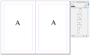
Set up your multi-page document and create automatic page numbering on the master pages.

If you want the page numbering to begin on the third page, go there and in the page palette, Override All Master Page Items. This unlocks the numbering so that changes can be made. You will notice that the faint dashed line that surrounds the text frame has reverted back to a solid line.

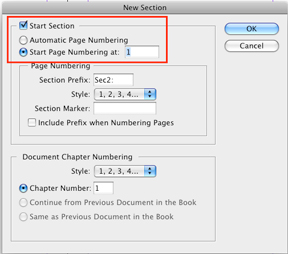
Next, go to Layout>Numbering & Section Options to bring up the New Section Dialog and set it up as in the example below and click OK. Now the third page should display the number “one.” The front cover still displays a “one,” and the second page, a “two,” but the third page begins again with number “one.”

You can delete the page numbers off the cover or any other page where it is not desirable to display page numbering by navigating to the page, overriding master page items and then deleting. Or, if you prefer, you can go to page two, for example, and in the New Section Dialog, you can change the style of the Section numbering to Roman numerals, or any of the other four ways of displaying page numbering.

Calendar Grid with Sliding Numbers

Creating a calendar from scratch and setting up the dates for each month can be tedious and frustrating, but it doesn’t have to be. The following method works equally well in Adobe Illustrator or Adobe InDesign.

Begin by creating a paragraph with 14 tab stops using an alignment of your choice. Use these paragraph settings to create a grid of numbers which you’ll duplicate and use on each of the subsequent months. The size of type and amount of leading in your number grid depends on the overall size of the squares used for each day.

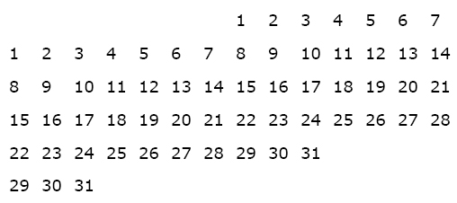
For the first line in the number grid, press the “tab key” seven times to move the cursor to the correct position to begin numbering. Set up a grid of numbers as shown below.

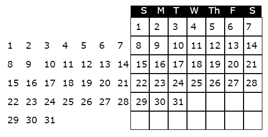
The next step is to create a an actual grid, or table to “hold” the numbers and daily information. To create the grid, use the table tool, or create a square that is the same width as your tab set, and depth equal to the leading. Use the “step and repeat” feature to duplicate the squares, and label the days of the week at the top of the grid. When the grid is completed it should look like the illustration below.

To use the calendar in a document, highlight the unused dates and make the type the same color as the background (usually white, i.e., no ink printed, so that one can write in the grid).

To create the calendar for the next month, highlight the number grid with the arrow tool, slide it into the appropriate position and white out the unused numbers.

Hope this technique saves you some time and frustration!

GR24 Final

Monday, December 15th from 1-3 pm in Com 151.