Entries in the '' Category

Calendar Grid with Sliding Numbers

Creating a calendar from scratch and setting up the dates for each month can be tedious and frustrating, but it doesn’t have to be. The following method works equally well in Adobe Illustrator or Adobe InDesign.

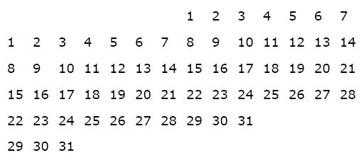
Begin by creating a paragraph with 14 tab stops using an alignment of your choice. Use these paragraph settings to create a grid of numbers which you’ll duplicate and use on each of the subsequent months. The size of type and amount of leading in your number grid depends on the overall size of the squares used for each day.

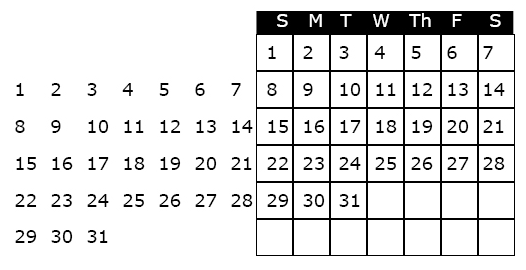
For the first line in the number grid, press the “tab key” seven times to move the cursor to the correct position to begin numbering. Set up a grid of numbers as shown below.

The next step is to create a an actual grid, or table to “hold” the numbers and daily information. To create the grid, use the table tool, or create a square that is the same width as your tab set, and depth equal to the leading. Use the “step and repeat” feature to duplicate the squares, and label the days of the week at the top of the grid. When the grid is completed it should look like the illustration below.

To use the calendar in a document, highlight the unused dates and make the type the same color as the background (usually white, i.e., no ink printed, so that one can write in the grid).

To create the calendar for the next month, highlight the number grid with the arrow tool, slide it into the appropriate position and white out the unused numbers.

Hope this technique saves you some time and frustration!
GR24 Final

Monday, December 15th from 1-3 pm in Com 151.

GR23 Final Project – Book

GR23 FINAL – Thursday, Dec. 11th, 6-8 pm, Com 109

Binding

  • Japanese binding style: stitched
  • Spiral – plastic coil
  • Spiral – wire
  • Comb bind
  • Velobind
  • Saddle stitch
  • Pamphlet stitch
  • Perfect bind
  • Nuts and bolts
  • Corner rounding
  • What’s your choice?

Paper

  • 20 lb. bond – inexpensive uncoated copy paper
  • 60 lb. or 70 lb. domtar plainfield -text
  • 60 lb. or 70 lb.Boise vellum – text
  • Translucent papers
  • Paper bag
  • Rice paper
  • Interior pages should be different than the cover stock

Covers

  • 80 lb – 100 lb. cover stock
  • Card stock – 8 pt. 14 pt. 24 pt. 40 pt.

Paper places

  • Continental Art Supply – Reseda bl. Just south of Sherman Way
  • Kelly Paper – Townsgate in Westlake Village, Lassen in Chatsworth

Page size

  • your choice

Number of pages

  • minimum 12 pages plus cover

Content

  • each page must have at least one image and one paragraph of text.
  • Each page must be numbered and may have other graphic elements on it.

Find/change Makes Quick Work of Text Editing

Really, it does.

Let’s say you just imported data from Excel into an InDesign Table, and low and behold, you’re noticing lots of what appears to be gibberish.  Strange characters make your text look like a bunch of “expletive deleteds.” Some of the “garbage” may actually be html code if your text originated on the internet. If it has characters like <p>, <strong>, or </strong>, these are html codes that are mixed in with the text.

In InDesign, go to Edit<Find/Change to bring up the dialog. The tab on the far left pertains to finding and changing any string of text, even “invisible characters,” such as a paragraph return, a space or a tab. You can change the found text to any other string of text or invisible character. You’ll find a chart with the special character codes on pages 421-423 of the InDesign Bible.

The find and change technique makes it easy to quickly search and replace double spaces with single spaces, remove extra paragraph returns by changing to “nothing” so that you can instead insert space above or below the paragraphs and changes crazy codes like (&#39;) which is html for an apostrophe (‘).

Tables Simplify Complex Formatting Tasks

Reading: Bible p.547-569 – Setting up Tabs and Tables

While InDesign allows for the most complex of formatting jobs, it supplies a number of tools to ease the tedium and redundancy where formatting text is concerned. When dealing with large quantities of data, such as the information for a price list or catalog, Tables can pick up where Paragrarph Styles, Tab and Paragraph Rules leave off.

First, consider the data flow. The initial data can originate from a number of sources. It may come from Microsoft Word, Excel, or it can come right off the internet. If you are getting the data from a website, ask the provider to export the data to an Excel file. Once you have the Excel file, you can open it and determine if any fields can be eliminated, as it is easier to edit the data before importing into InDesign.

Creating the Initial Table

With the data finally prepared, go to File>Place, importing the Excel file into InDesign. When placing, be sure to check “Show Import Options.”

In the “Show Import Options” dialog, at the top of the dialog you’ll see, “Sheet.” Here, you need to choose the specific worksheet associated with the Excel file.

Formatting: Table > Unformatted tabbed text. By choosing this option, you will be able to control all aspects of formatting the table in InDesign.

With an active text cursor within the table, Select>All and go to the Table Menu>Convert Text to Table. The Column separator can remain set at Tab, and the Row Separator at Paragraph.

Apply Design Styles to the Table

Once your text is converted to a table, it is similar to an inline graphic in that it resides within a text frame. However, to make changes to the table or its contents, use the text tool. With an active cursor in the table, you can edit the column or row size by moving the cursor directly over the line. When it turns to a double-headed arrow, click and drag to change the size. Edit the column widths appropriately so that the rows fit comfortably on a line.

Drag with the text cursor to highlight text in a cell. To highlight all the text in the table, first highlight a row, then go to Edit>Select All to change the font, style and size. Incorporate paragraph styles and a complex task is eased.

The Table>Table Options gives information about the table, and control over the spacing, strokes and fills for columns and rows in the table for graphic customization.

Production Made Quick and Easy

No matter what type of publication you’re working on: newsletter, magazine, brochure, catalog, greeting card, etc., once the design problems are resolved, the rest is mostly production work. Because production work tends to have repetitive procedures, there are a whole slew of “tricks” that can speed the process up and take the tedium out of the work.

The Page Palette

  1. Duplicate a page with all of its elements, including guides – Click on the page in the page palette, hold down the option key and drag it below the existing page. Voila, a twin!
  2. To edit and remove master elements from a page in the publication – Click on the page palette pop up menu>Override All Master Page Items. They are no unlocked and free to move about the cabin.
  3. In the same palette, you can steal master pages from other documents by first saving, then loading master pages.
  4. For that matter clone a page from a different file by dragging its page icon from one file to the other.

Step and Repeat

  1. One of my favorite and one of the more useful features for production is Step and Repeat found under the Edit Menu. Use it to duplicate and position elements with a single operation.

Assign Color to Line Art

  1. In photoshop, convert your line art to Bitmap. If you scanned it in RGB, you’ll need to convert the file to grayscale before converting it to Bitmap. In the conversion dialog, choose 50% threshold, which converts all pixels under 50% gray to white, and those greater than 50% to black.
  2. Place the bitmap file into InDesign.
  3. Select the content of the frame with the Direct Select (white) arrow tool and the “fill” swatch active.
  4. Choose a color from the swatches palette to convert the contents to the desired color.
  5. To fill the background with a color, use the Black Selection arrow tool.

Layout the Greeting Card in InDesign

This is the infamous missing post on the steps for creating the greeting card layout in InDesign.

  1. In the “new document” dialog turn off facing pages. Your greeting card will have an outside front and back which print on the same page, unfolded. If your card opens to a verse, add a second page. Turn off “facing pages.”
  2. A horizontal, greeting card when opened flat has a horizontal fold down the middle, a vertical card has a vertical fold down the middle. When setting up the new document, take into account that the card width will double on a vertical card, while the length will double on a horizontal card.
  3. Set appropriate margins if your card is going to have a white border or if you need a guide for your type.
  4. If your card is going to bleed, make sure to indicate .125″ bleeds in the document setup dialog before clicking ok. If you don’t see the settings for bleed, check the “more options” button.
  5. With the new document open, go to the Layout menu>Create Guides. You can divide the page in half vertically (2 columns with 0 gutter) or horizontally (two rows with 0 gutter).
  6. To import an image from Illustrator or Photoshop, go to File>place.
  7. Size the image appropriately
  8. Add type and logo or other graphic to back of card.
  9. Create a second page in the page palette by dragging a blank page from the top of the panel just below the icon for page one, and add type for greeting if desired.

Set of 4 cards Due Nov. 12th, printed and stuffed in envelopes.

Register at Veer

Register at Veer to keep abreast of their new type and images. You’ll get regular mailings with tons of terrific idea-starters.

‘Keep it Together’ or how to make sure you don’t lose it in InDesign

InDesign provides a number of techniques to keeping text and/or objects together as you move elements around on their pages, or to new pages.

  • Grouping – this is probably the most obvious way to keep two or more objects together. The dashed bounding box provides the visual clue to alert you to group objects. You’ll find the Group command under the object menu
  • Inline Graphics –  cut or copy any graphics or text frame to the clipboard, create an insertion point within a text frame, and paste to create an inline graphic
  • Paragraph Rules – this is a great technique for reversing or overprinting text on a colored box. Use Rule Above or rule below, make it a few points larger than your type size, and offset to position as desired
  • Anchored Objects – Use this method to attach a text or graphics object within or outside of a text frame. Choose an insertion point; then go to Object>anchored objects>insert
  • Documents – Create an InDesign book to link several documents together. One of the advantages of using the book feature to link documents is it’s ability to keep track of the pagination, renumbering the pages in all subsequent documents when a change is made in one document

Newsletter Exercise

The object of the exercise is to assemble the elements the Westlake Village Art Guild 4-page newsletter and format the text and graphics to match the example you have been given. Although the original does not include page numbers, I would like you to add page numbering to your newsletter. The completed newsletter should be printed in color, if possible. Turn in a “for print” PDF, as well as a color printout. Exercise is due Nov. 12.